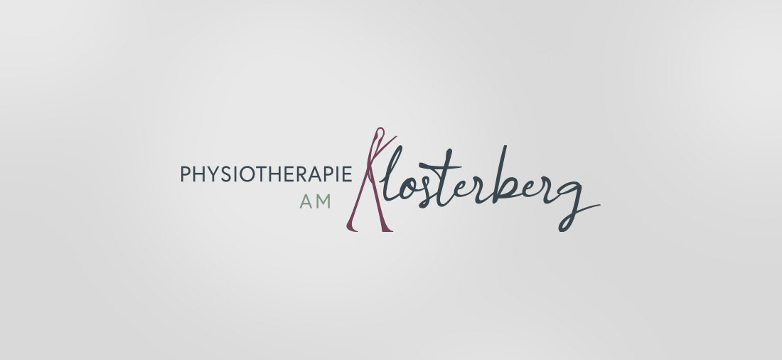
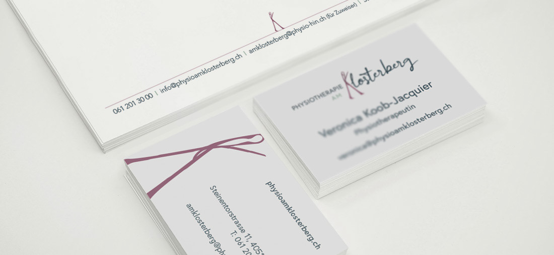
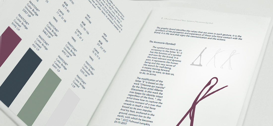
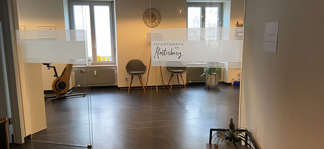
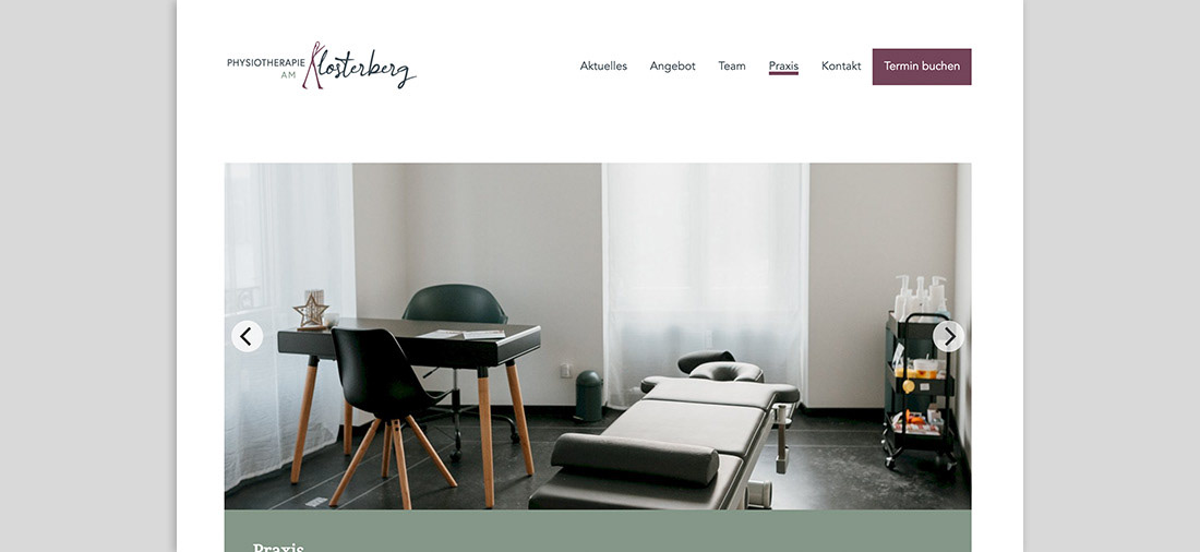
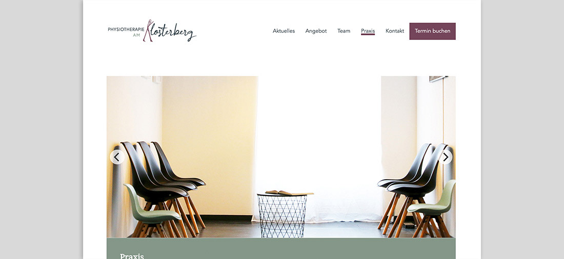
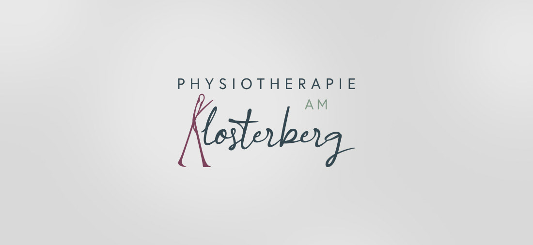

Place: Basel, Switzerland Client: Physiotherapie am Klosterberg Brand: Physiotherapie am Klosterberg Field: Health / Salud Case: Brand design Physiotherapie am Klosterberg: Specialized physiotherapy We have three main types of corporate items: A first element is the text “PHYSIOTHERAPIE AM” in capital letters, it goes to identify and categorize the activity. Another element is the word “Klosterberg” in handwritten letter that personalizes and includes human intervention. Finally a third element as an accessory in the letter “K” it serves as an independent symbol to represent the brand, adds a spirit, a feeling, energizes and adds personality. The modification of the letter “k” is based on the work “L’Homme qui marche” by the Swiss artist Alberto Giacometti, in this work the man keeps his identity intact regardless of the form, “...the artist knew how to capture the decisive moment of a man that reveals in itself a vital force based on its own impulse. And his feet, anchored in the ground, connect him to the earth, with which he becomes one ”. (CC) Fulwood Lampkin, 01-11-2017. Brand diagnosis, development and design of graphic brand and manual of the graphic brand identifier, design of corporate applications.